1 min read
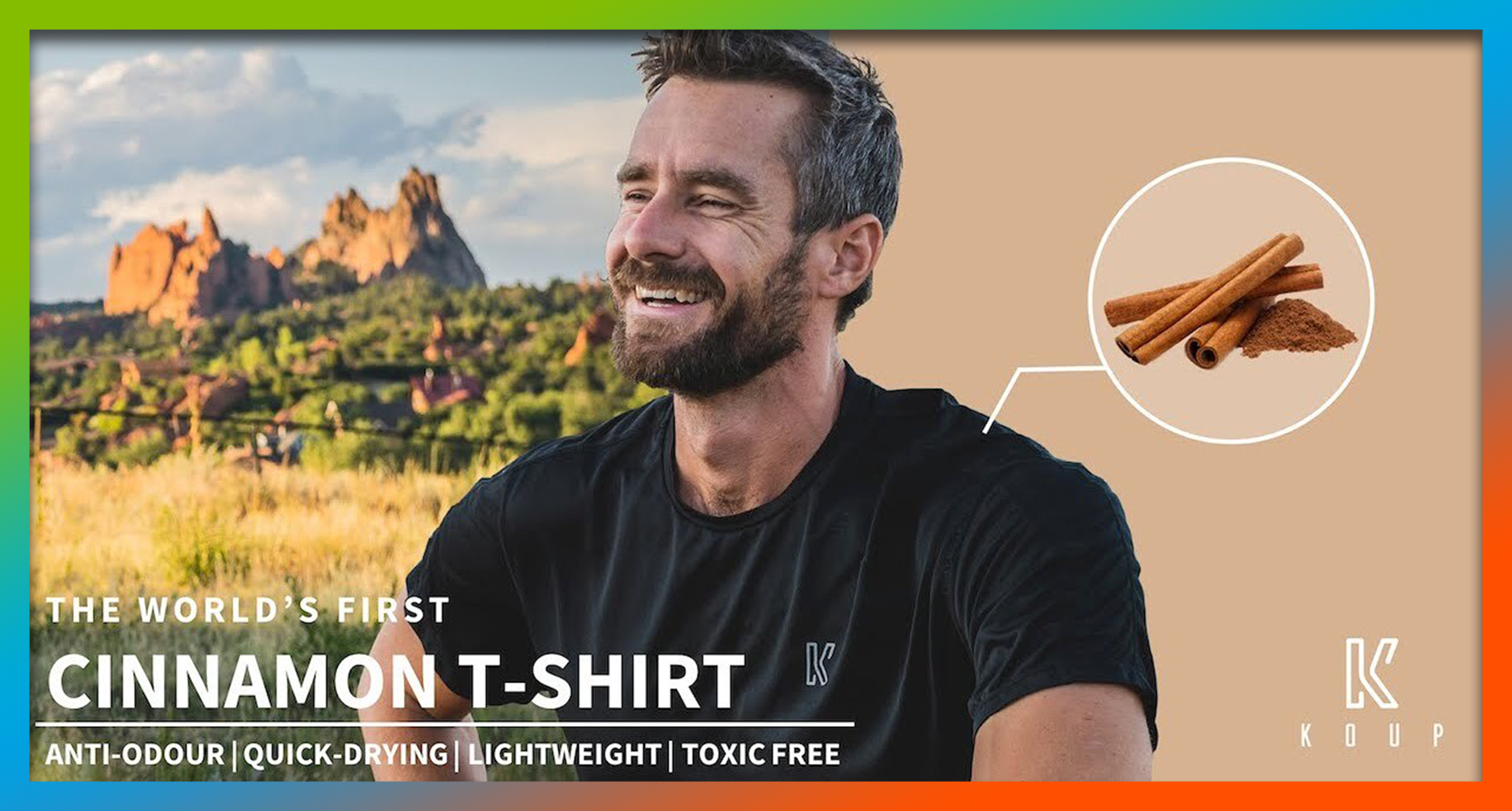
In the news: New Performance T-shirt Made With Cinnamon Stifles Odor
An apparel company is using an ancient Egyptian secret to keep shirts smelling clean for longer - cinnamon. Koup, a new start-up company, will debut...
1 min read
admin : Mar 3, 2021 5:23:15 PM

Burger King has completely overhauled its brand identity with a new retro logo, warm-toned packaging, and refreshed uniforms for employees. The new logo will look familiar to most people - at first glance the changes made are almost indecipherable. It’s simple, minimal. And the packaging, which features the names of ingredients used in the enclosed food products, coordinates with it well.
The "Home of the Whopper" is dialing back the clock and drawing inspiration from nostalgia with "new" branding reminiscent of its look from years ago. With a throwback to its original '69 logo, they nixed the 3D design for a flat, cleaner image, which shows the company name in capitalized boldface font, nestled between two buns, resembling a burger. The rebrand includes an eye-catching individualized design on the top of each packaging component in Flame Sans font, a nod to their slogan, "Flame Grilling Since 1954". Also inspired by the company’s flame-grilling process is their color palette, made up of primary colors "BBQ Brown," "Firey Red" and "Flamin' Orange".
Fast food companies, and other businesses that have implemented uniforms for their employees, are increasingly deviating from stuffy traditional styles in favor of customized uniform options and the opportunity for some outfit-building. Burger King’s new uniform is compiled of T-shirts with cartoon-y renderings of burgers and fries, polo shirts, hats, and aprons. There also appears to be an enamel pin set to complement the uniforms.
Many companies are providing their uniforms through company stores, offering employees branded apparel that still adheres to uniform guidelines but is flexible enough to allow for personal expression. Uniforms seem to be trending this direction - companies benefit from a unified brand experience and professional look, while appealing to the changing fashions of younger generations entering the workforce. The result is a put-together brand image without mandating that everyone wears the same button down or apron.
Burger King is a staple to American society. It's successful. It's weathered storms and knows how to stay afloat and relevant. Company stores and retail-inspired looks are going to dominate the workforce and provide the perception of modernity, even if the designs themselves are '70s-inspired. Overall, this is a good example of brand cohesion from the new logo down to the smallest piece of packaging. Above all, a successful brand is consistent.
Connect with us today to help achieve the consistency your brand deserves through an online store!

1 min read
An apparel company is using an ancient Egyptian secret to keep shirts smelling clean for longer - cinnamon. Koup, a new start-up company, will debut...

1 min read
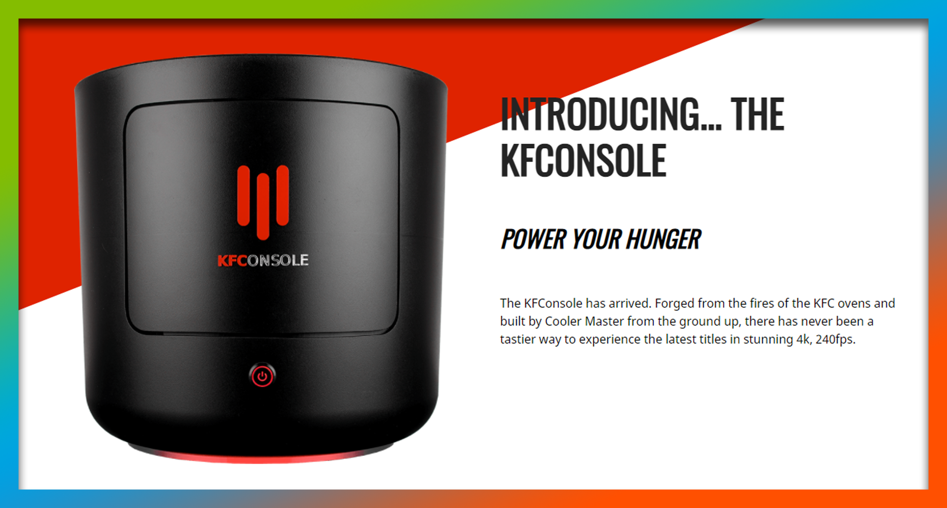
KFC originally announced the development of its fully functional branded video game console in June, and most people figured it was another marketing...

2 min read
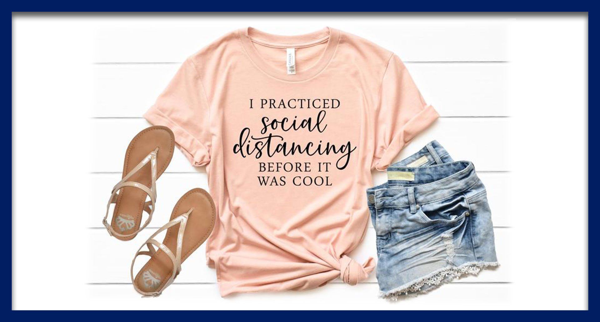
The ever-popular t-shirt has taken on a new role within the past year as an everyday essential. Now, the same casual tee can transition from a full...